Don’t tell it like it isn’t
One of the cardinal tenets of NLP is that intentions must be ‘well formed’ – that is, framed in positive rather than negative terms. You should always focus on what you do want, rather than what you don’t want.
This feeds directly into the words you use, in both speech and thought. If you want to lose weight, you might find it easier to focus on ‘getting slim’. If you want to stop smoking, you could define your goal as ‘becoming healthy’.
The theory is that the unconscious mind works in images rather than words, so it can’t focus on something that isn’t, only something that is. So if your intention is ‘not to be so impulsive’, your mind discards all the abstract terms and latches on to ‘impulsive’.
Anyone can accept this idea up to a point. If you got in a black cab and said ‘out of London’, you’d expect a withering look through the driving mirror. ‘Anywhere but here’ is not a useful destination.
But what about copywriting? Should we always talk to people in positive terms, about the value they gain from a product? Or is there something to be said for describing what they stand to be rid of, or get away from?
Attraction and repulsion
Whenever we try to sell a product with words, we have a choice between evoking one of two kinetic emotions: attraction or repulsion.
If we make a product seem attractive, people will want to move towards it. This is the simplest, most direct form of copywriting, using benefits to sell a product.
With repulsion, we add in the negative corollary of benefits. If we make an alternative to our product, or the lack of it, seem unattractive, people will want to move away from those things towards our product. If the alternative is a competing product, we could even talk about its deficiencies, using what’s called ‘knocking copy’.
Most ads that use repulsion combine it with attraction, which raises the question of whether to lead with attraction (‘This product’s great, unlike the alternative’) or repulsion (‘The alternative’s rubbish, so buy this product’). You can see the former technique in TV adverts for Fairy Liquid that compare it with the ‘leading brand’.
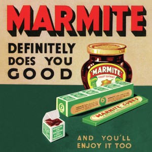
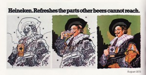
However, there’s no need to be so literal. You can also do the same thing jokily…
…or implicitly.
In both these examples, the brand is set up in contrast to a vague or implicit ‘other’ that the audience can fill in for themselves. Heineken loftily alludes to ‘other beers’, implying its own uniqueness, while Apple promises intellectual and cultural cachet for those who can wean themselves off Wintel. You too can be like Picasso!
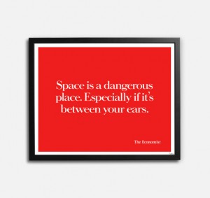
Repulsion can also carry a sense of criticism or admonishment: ‘are you really so stupid not to use this product?’ Many of the famous Economist posters do this, using wit to disarm the insult.
Some ads go further, painting a horrific picture to scare the audience into buying. In this TV ad, a nauseatingly gunked-up dishwasher is transformed into a gleaming paragon by Finish.
Here, the danger lies in evoking a vivid mental image you don’t actually want the audience to retain. If you’re going to dig yourself into a hole, you’d better be sure you’ve got the rhetorical firepower to climb out of it again:
A day may come when the courage of men fails, when we forsake our friends and break all bonds of fellowship. But it is not this day!
Spoken by Aragorn in Lord of the Rings: The Return of the King
It’s the same if you name, or talk about, a competitor’s product. If the audience remembers the wrong brand, you’re worse off than before. Or they might just decide that they want a burger without really caring where they get it. I call this ‘generic selling’, but there’s probably a proper name for it.
Gym bunnies
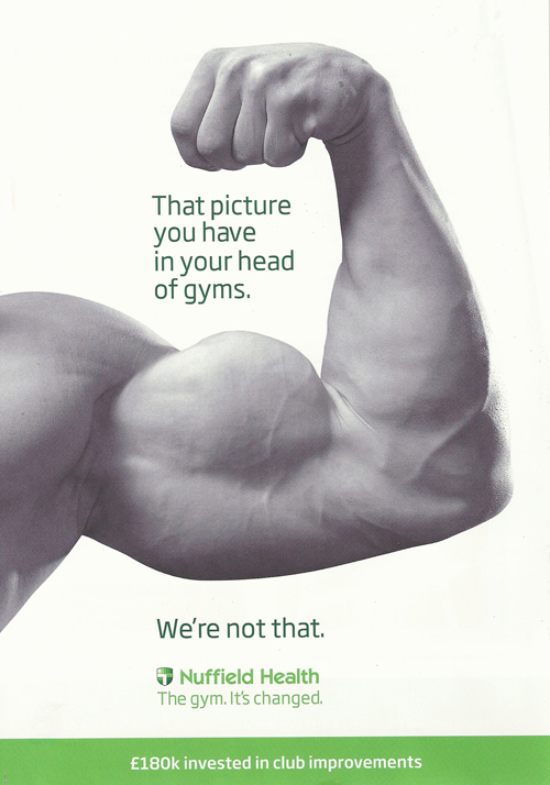
All this came to mind when I received the flyer below from Nuffield Health.
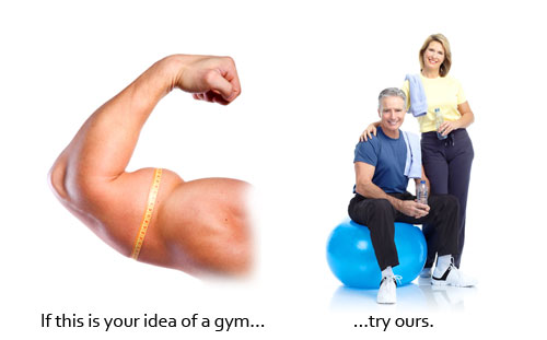
Here, the whole creative concept is predicated on repulsion. The headline invites us to think about our mental image of a gym. The image backs up the headline, positioning gyms as sweaty, oppressively masculine places where grunting Muscle Marys whale on their pecs.
The flyer then flips that message by asserting that ‘We’re not that’ but without telling us what they actually are. This is an ‘anywhere but here’ formation of the type that NLP practitioners disapprove of. The corporate slogan – ‘The gym. It’s changed.’ – riffs on the same theme without explaining the changes.
Too much negative, not enough positive
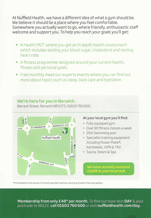
When we turn the leaflet over, we finally get some good selling points. But with the map and the contact details lurking below, it all feels a bit afterthoughty and ‘back of leaflet’. The deal should have been closed by now, with the bullet points giving us the info to post-rationalise an already-made decision (‘it’s £48 a month, but I do get all these things’).
The image on the front, which could have added more positive content by showing us how nice Nuffield’s gyms are, instead adds to the ‘gyms are horrid’ theme. It’s visually arresting, but with space at a premium, it means that a bulging bicep is all the visual equity we have to take away.
My feeling about this leaflet is that it spends too much time on repulsion, not enough on attraction. By the time we learn that Nuffield is offering us something different, there’s no space to tell us much about it.
Parallel processing
One alternative approach would be to show the ‘repulsion’ and ‘attraction’ messages side by side, allowing the reader to process them in parallel, or switch back and forth between them.
In this concept, the logical flow leads the reader from negative to positive and from the premise (if) to the desired conclusion (then), which also functions as a call to action. Everything is positively framed, and the two clauses of the sentence mirror the two images, helping the whole function as a gestalt.
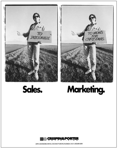
I use a similar approach on my home page, but I can’t take credit for it. It’s based on an ad for agency Crispin + Porter (later Crispin Porter + Bogusky) that’s featured on page 16 of Luke Sullivan’s Hey Whipple, Squeeze This!
In my derivative version, my website visitors are invited to contrast ‘writing’ with ‘copywriting’. The implication is that the ‘writing’ is what they currently have, or perhaps what they’ve written for themselves, while ‘copywriting’ is the (hopefully superior) professional alternative. Each image is based on a different principle (benefits, emotion, concrete language etc), allowing the visitor to apprehend implicitly what they can read about at great length by trawling through this blog.
So, is it always wrong to tend towards the negative? Probably not – I’m sure there are loads of classic ads that do exactly that, especially those for ‘problem solutions’ like insurance or mouthwash. But my personal take is that if you’re unsure about using the tactic of repulsion, it’s probably worth making sure that positive sentiments outweigh the negative.
Tags: Apple, CB+P, Crispin + Porter, Finish, gestalt, Heinken, Hey Whipple Squeeze This, Luke Sullivan, Marmite, NLP, Nuffield Health
