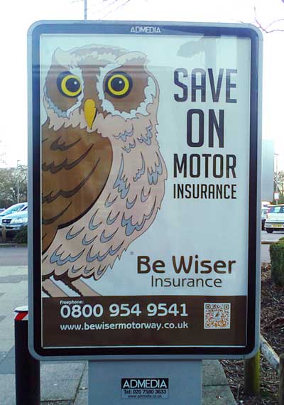
Best poster ever
I’m not sure if this brilliant work is a commercial masterstroke, a postmodern critique of the marketing discipline or a parodic satire of convoluted brand thinking. Perhaps it’s all three at once. Whatever it is, it demands our attention – and our respect.
It begins with the look and feel, which stands completely apart from anything else you’d see on an outdoor display ad. Obliquely deriding the safe, token gestures towards ‘creativity’ of mainstream design, it shows us that true originality knows that ridicule is nothing to be scared of. It gambles with reputation – and wins big.
In a move clearly intended to bring triumphant closure to the endless ‘make the logo bigger’ debate, Be Wiser canonise their marque as a hero image, giving them licence to make it as large as it could feasibly be. In the case of this poster, that makes it about 5ft high, with the word ‘insurance’ squished into a ludicrously narrow measure to accommodate it. Even the most insecure marketing manager would nod approvingly.
And the logo receiving this reverential treatment? Taking its cue from the company name, it’s an owl. But not just any owl – a discomfitingly glassy-eyed, clipartesque bird that wouldn’t have been out of place in a school maths textbook of the 1980s. When such an intimidating beast stakes a claim to a brand value like wisdom, few will argue.
The headline, ‘Save On Motor Insurance’, is nothing less than astounding. Eschewing all poetics, invention and ornament, it doesn’t express the benefit so much as confront us with its absolute, irreducible quintessence. In its plain, journalistic simplicity, it reminds us of the craft of Hemingway, or perhaps Orwell. The meaning is clear; the implications, profound.
This is tone of voice as weapon. It is writing that, by undermining the whole concept of style, radically subverts the raison d’être of copywriting. This bold act of unwriting – or anti-writing, perhaps – tacitly mocks the copywriter’s quest for original or arresting expression, exhorting us to discard our armour of pretension and throw off the mental chains of convention. Will we answer the call? Dare we?
In recent years, retail finance has arguably produced some of the most inventive and innovative marketing to be found in any sector. Driven by the need to differentiate in an environment dominated by cost, marketers have devised vividly memorable campaigns centred on characters as diverse as meerkats (Compare the Market), aristocratic advisors (Credit Expert) and opera singers (Go Compare).
Be Wiser’s poster makes a decisive break from this narrative. It is both a nostalgic look back to the very dawn of advertising and a direct challenge to our newfound faith in ‘engagement’ and ’emotion’. Its proud indifference to received wisdom unmasks its rivals’ positioning as being more about imitation than differentiation – brands that are all ‘different’ in the same way. At the same time, it confronts us with the disturbing notion that what we think we ‘know’ about marketing may actually be closer to ideology than to science.
Overall, the poster projects a dry, ascetic atmosphere that brings to mind the austere discipline of Bauhaus, or the opaque sound pictures of Philip Glass. No image of ‘motors’ or their drivers intrudes; no colour other than brown and yellow. There is no time or space for us, no love, no life, no hint of human beings or what they feel. The poster has taken us beyond such things. Now there is only motor insurance, and the imperative to save on it.
Sheer genius.
