The power of long copy
In winter, I suffer from very dry, painfully chapped hands. It doesn’t matter how much cream I apply, they’re like sandpaper. So I was pleased when my Dad (who also gets them) tipped me off to Kiehl’s Ultimate Strength Hand Salve, which lives up to its name and really does what it says on the, er, plastic tube.
 In fact, I was so pleased with the product that it took me a while to take in its presentation. But then I realised that Kiehl’s is the only brand I’ve ever seen to use long copy on its packaging.
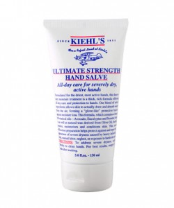
As you can see from the image, the salve features an extended block of text outlining its formula, benefits and directions for use – right in your face on the front of the tube.
Don’t worry. This isn’t going to be another instalment in the interminable ‘long copy vs short copy’ debate. Each has its place. All I’d like to do is explore why, in my opinion, this particular piece of long copy works so well.
Difference
Most hand creams go for simple, uncluttered packaging. They usually opt for gentle, natural colours (particularly if they contain aloe vera or something similar), flowing shapes and ‘feminine’/clinical typography – typically a rounded sans-serif face. And there won’t be very much text – just a brief description at most.
Kiehl’s utterly disregards the received wisdom with a freezing cold white background, corporate blue text (set in Times!), block bold capitals and brutal red underlining.
The coup de grâce is the image of the biplane, which flies from right to left and also in the face of design orthodoxy: faces, arrows and anything else facing right mean ‘forward, progress, positive’, while facing left denotes the opposite.
Finally, we’ve got that copy – a massive block of text taking up more than half the space on the tube. (Any designers reading? Would you have done that, whether requested to or otherwise?)
It all screams ‘different’. And for me, that chimed perfectly with the way I discovered the product: recommended to try it with the promise that it would be something different from what I’d used before.
And when I came to ‘touch the brand’ for the first time when I found the product in a shop (the ‘first moment of truth’ in marketing-speak), the packaging sustained and intensified that sense of difference. If it had just looked like every other cream, would I have believed it was different inside?
Depth
At this point, I should confess that I’ve never actually read all the Kiehl’s copy from start to finish. But that’s the point – I don’t even need to. The medium is the message. Just by being there, the text conveys the idea that this is a product worth talking about – a product with depth. And in a sense, this is what I was looking for – a moisturiser that had been more carefully formulated than others, that would last longer and deliver more benefit.
As it turns out, the copy does an admirable job of explaining the benefits of the product. It’s not just visual window dressing, included because the designer didn’t have enough elements to balance the layout. But I still believe that it’s the presence rather than the content of the copy that has most impact – and that Kiehl’s know this very well.
In other words, this layout has been deliberately chosen in order to show text on the front, not because all these points urgently needed to be made. (They could have gone on the back, in any case – or been abridged into bullets.)
Authority
Along with the self-consciously clunky design, the Kiehl’s text exudes an air of functionality, expertise and authority. Again, it’s not so much what is said (although the content is suitably dry and scientific) but the fact it’s being said at all.
More precisely, it’s the unexpectedly long text in context that has impact. When we say ‘long copy’, we really mean ‘long in context’ rather than any specific length. ‘Long’ means different things depending on medium, channel and sector. In this case, we expect to see about ten words and actually get around 100.
Long copy conveys authority because it implies the brand or product is worth talking about. If done with confidence, as here, it tells the audience that there’s a lot to say – rather than hiding behind the bluff of inarticulate imagery, this brand comes right out and says what it’s all about. As a copywriter, I applaud Kiehl’s faith in the written word as a selling tool – but again, it’s really the fact of the copy’s inclusion, rather than its content, that does the business.
Every angle is a compromise. Something is gained and something is lost. In this case, Kiehl’s has completely dropped any attempt to be cool, desirable or ‘lifestyle’. Eschewing funk, it goes all-out for authority – and succeeds. By having so much to say, it claims a value that other brands have neglected and makes it all its own.
Take the long way
I hope I’ve explained how long copy can be so effective in the right situation. There should always be a lot to say about your product or service – it’s just a question of whether and when you choose to say it. By breaking with convention and bringing loads of words when few are expected, you can mobilise the power of long copy to convey unique or unusual brand values and establish a strong differentiation from competing ads or products.
Tags: brands, Kiehl's, long copy, moment of truth, Ultimate Strength Hand Salve